- Thursday, August 4th, 2011
- of states and styles
-
For those of us living in the United States, the boundaries drawn so many years ago between this state and that define the political scrum. We live in red states or blue states or perhaps one that’s thought to be in play (which reliably means more political advertisements per capita than elsewhere).
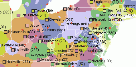
But while our state of residence matters greatly — especially regarding the taxes we pay versus others — we often think of who we are and where we live in other ways. Enter the CommonCensus Map Project,CommonCensus Map Project | It was created by Michael Baldwin. a crowd-sourced site that shows how people actually characterize the region or town or neighborhood where they reside. Here’s a portion of one that shows how cities dominate areas without regard to state lines:

You can see how this concept could be extended into “states” of a different kind — how cultural beliefs and shared traditions tend to cluster, even in our mobile society.Check out the sports maps on the site, for example. (Although I know that there’s one incredible concentration of Yankees fans in North Dakota that hasn’t been captured on the MLB map.) While aggregating information on the Internet wasn’t possible back then, the seminal effort in this realm came thirty years ago, with the publication by Joel Garreau of The Nine Nations of North America.The Garreau Group | Under “new stuff” you can see that Garreau is still applying the concepts. Think, for example, about how he anticipated the emergence of Ecotopia (in a narrow slice of the Pacific Northwest) and MexAmerica (in the Southwest).
OK, so what does all of this have to do with investments? I have written before about “where we draw the lines”the research puzzle | One aspect to consider is how those lines are perpetuated in our analytical processes. and how drawing those lines can restrict flexibility in a way that hurts the decision making process (and results). Yet large swaths of the business operate as if the lines came from some investment god and were immutable, as if those state lines, to borrow the analogy, were the be all and end all.
But they aren’t. So, how do we look at the “real” maps of investment style and process? How do we go beyond the simple descriptions to get a more nuanced view of how asset managers differ from one another? And, while we’re at it, wouldn’t it be nice if we could put those maps in motion, to observe the ebb and flow that occurs in response to market events and competitive pressures?
Unfortunately, crowd sourcing won’t work in this case (although some hints can be gathered from surveys of one kind or another), so observation and inference will have to do. In future postings, I’ll examine some of those territories. As my ideas unfold going forth, I will convey them in words — don’t expect me to get out the electronic colored pencils and draw a map of the investment world showing the conventional boundaries and the unconventional regions that cross them.
Those who choose investment managers need to understand where those managers “live” — and not by using the equivalent of a 1960s-era globe in a classroom. Managers themselves, especially those who don’t fit easily within the boundaries, must figure out how to communicate their location on the map (and how they move about it) while being aware of the geographical orthodoxy of the day.
Not quite a magical mystery tour, but we’ll have some fun along the way.
