- Thursday, March 22nd, 2012
- pathways
-
Images are effective idea triggers. For instance:
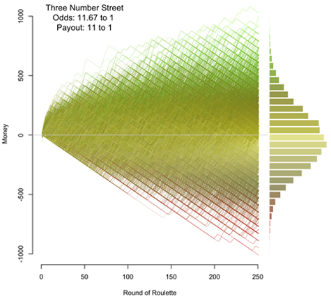
This is one of a number of graphs put together by Jay Jacobs, which he generated “as a way to understand the probabilities of the different betting options in roulette.”Behavioral Security | Here’s the original posting. This image is that for “betting on three numbers.” He told me that the analysis that he did was “a whim done over a weekend.”
The instant I saw the first of these images, I thought of a posting I had written called “the error price,”the research puzzle | This essay is from early 2010. which was really about target prices in equity analysis — and the idiotic industry practices that surround them. To quote: “A single-point error price would have many of the same problems as the single-point target price does, but including it in an analysis is the first step toward a much better framework for decision making, by simply acknowledging the existence of the other side of the distribution of outcomes.”
Here and there you see a few firms that provide a simple look at their concept of that entire distribution, including Morgan Stanley, whose “risk-reward snapshot” for Apple provides a sizable range of potential prices across time (with the target price being within the band rather than at the upper edge of it).Business Insider | In typical BI fashion, this links to a slideshow with additional information from Morgan Stanley. A simple approach, but a helpful one, as long as you know the methodology for creating the range.
What is not provided by Morgan is some notion of the probability distribution, which is so easy to see on Jacobs’ chart. What you’d like, of course, is an image that’s driven by a model that has probabilities for the main drivers of the company and for low-probability, high-impact, non-normal events as well. Something like that sounds needlessly complex, but if a model is supposed to represent reality, shouldn’t it be able to do some fancy what-ifs? Certainly the computing power exists today to transform that complexity into simple images that help investment professionals contemplate what might occur.
Of the image above, Edward Tufte would undoubtedly say that there was “too much ink” used, so if you’d want to take it from a weekend project to a TED presentation, you’d have some choices to make about how to show the information differently. And a day-to-day user would want tools that enabled her to drill down to the complex underlying assumptions and to manipulate the inputs in an interactive fashion. Roulette rules are pretty straightforward; market realities are not.
The visual gets one thinking about all the different ways that these analyses could be used. How would a fundamental analyst’s distribution of outcomes differ from that of a quantitative analyst’s for a particular company? Track that for awhile and you’ll get a sense of whether and how the fundamental analyst adds value. How does the matrix change as valuation changes?
Or think of mapping a portfolio’s possible returns if it has a lot of embedded optionality. A pre-2007 image of structured finance exposures would have shown some alarming scenarios if illustrated like this — that is, if the underlying assumptions were sound.
Which reminds me of Monte Carlo simulations for financial planning. If the baseline assumptions are flawed or skewed, the answers you get could be destructive, a point that I made in a comment on a recent Michael Kitces posting about longevity risk:Nerd’s Eye View | Kitces writes, “My passion is to help advance the financial planning body of knowledge and distill complexity into practical applications . . .. Most Monte Carlo simulations are run with expected return forecasts that aren’t conservative enough, so all that computational horsepower can feel like it’s getting you somewhere that it’s not.
In investment analysis, we seek ways to think robustly about the pathways of the future for a security, a portfolio, or an asset/liability problem like retirement. Images can be remarkably effective at helping us do so, which makes the relative lack of effective ones in most investment materials disheartening, but pretty pictures aren’t enough if they don’t represent the possibilities in a reasonable way.

