- Thursday, June 2nd, 2011
- picturing process
-
Much of my work takes place at the intersection of investment process and communications, so I have seen a fair number of pitch books and client review books in my time. Trying to represent an investment process visually is rather difficult; it’s tough to capture the process and still have a page/slide work effectively within a presentation (and be in concert with the overall design and brand).
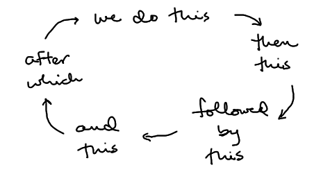
Often what you see fits this format:

It may be presented in a linear fashion rather than circular one, but simple, step-by-step graphics like this are typical, often featuring arrows to indicate movement between the steps. For evidence, do a search of “investment process” on Google Images.Google Images | Here are the results. Pyramids are popular too — and you’ll see some flow diagrams that are like the ones you may have learned in a computer programming class way back when. (For even more fun, you can sort the Google results by color to see which images are visually attractive and which are, well, garish and off-putting.)
Those who have tried to picture investment process know how difficult it can be to take a complex set of analyses and interactions — that often don’t proceed in an orderly fashion — and present them in a way that’s simple and compelling, yet faithful to what you really do. Those who have sat on the other side of the table (the buyers of investment services) can attest to the fact that after awhile most of them look pretty similar and that rarely do any give a clear indication of what differentiates a particular firm from all of the others.
One of the challenges results from trying to create an interesting story while giving the person listening to the pitch something to take away from the meeting. It’s easier to do a presentation like those often given at TED,TED | “Ideas worth spreading,” indeed. where the visuals are used to intrigue and to augment the story being told rather than to document it. For instance, if I was doing a talk on investment process, I could see using the “birds on wires” photo that showed up in those Google search results,Texas Presbyterian Foundation | In this case, it comes not from the site of a money manager but that of a foundation. but it would be hard to use it in a standard pitch book and expect it to stand on its own very well. For better or worse, some words need to be on the page (the “worse” part of it all, of course, is that a high percentage of presenters end up reading them by rote and missing the opportunity to really communicate with the audience).
A consistent and effective design template is important when crafting a pitch book, but even when that’s in place, it can be wasted by bad choices as to content. For instance, it’s common to see poorly conceived or executed charts in investment presentations, but there are usually better alternatives readily available. The pages about process and other amorphous concepts are more problematic. Everyone wants a compelling graphic to illustrate process, but if it really illustrates nothing, why use it? What percentage of those Google search results would you describe as attractive and informative?
This is a problem that is vexing even for large organizations with expansive marketing departments, so there aren’t any easy answers and certainly no magic formula that I can give to you — the approach that should be taken needs to fit the unique nature of a firm. But the sad truth is that forcing a picture of process often distorts it rather than communicating it clearly, and rarely makes it memorable for those you are trying to impress. If you can’t do it well, don’t do it at all.
